Developing an iPad Interface for Biosfär's Innovative Digital Tool
I was part of a university project that collaborated with Biosfär, a startup that aimed to use digital technology to improve dementia care. Their objective was to develop a secure virtual environment, similar to an IMAX experience, which could be integrated into nursing homes to promote well-being, community building, and connectivity with the outside world.
Our team was tasked with designing a high-fidelity prototype of the Biosfär digital tool's user interface specifically for an iPad platform. With my active involvement, we conducted extensive user research and testing to customize the prototype to the needs and motivations of healthcare workers, who were the primary users. The prototype underwent evaluation by both expert feedback and heuristic metrics, resulting in a successful outcome - a clickable, high-fidelity Figma prototype optimized for the iPad interface.
MY ROLE: RESEARCH & UX/UI (Total of 4 group members)
TIMELINE: 9 WEEKS (HALF TIME) TOOLS: FIGMA, MIRO
METHODS: USER INTERVIEWS, SURVEY, OBSERVATION, AFFINITY DIAGRAMMING, CARD SORTING, WORKSHOP, LO-FI SKETCHES, WIREFRAME, HI-FI PROTOTYPE, HEURISTIC EVALUATION, USABILITY TESTING

CHALLENGE
The challenge for this project was to design a high fidelity user interface for Biosfär's digital tool that allowed senior citizens, particularly those with dementia, to experience a virtual environment that promoted their overall well-being. The digital tool's current installation was a prototype that used two projectors and two screens to give the illusion of a long curved screen. The digital tool used Youtube and Google image search to create the virtual environment, but Biosfär planned to create its own media content in the future. The main user group for the interface solution was nurses and staff working in the facilities, who controlled and orientated the interface, while the secondary user group was the elderly with dementia, who were affected by how Biosfär was used by the nurses and staff. The interface needed to be user-friendly, easy to learn, and fast to use by the main user group, while also appropriate to experience by the secondary user group. The high fidelity prototype was designed in Figma, based on how the future Biosfär interface could look like when it would offer its own media content and material.
RESEARCH
User Interviews
To design a suitable interface, we used user interviews to understand the context, routines, experiences, and preferences of the user group. User interviews provide insights into attitudes, preferences, and behaviors. The interface should be intuitive and easy to use, so it is crucial to consider the work context's opportunities and limitations.
To ensure focused discussion, we conducted semi-structured user interviews with 26 open-ended questions related to the work context, activities with residents, knowledge of the elderly, and technology. We recruited participants through convenience and criterion sampling, and informed them about the purpose and their rights. The interviews were conducted with caregivers from two nursing homes in Stockholm, audio-recorded, and transcribed.
Surveys
Surveys were chosen as a complement to user interviews to reach more users and consider other residential homes. Interviews provide in-depth information, while surveys provide geographical spread. The survey questions were inspired by the interview guide to compare answers. Care workers who work at a residential home with residents diagnosed with dementia were the survey participants, and they were contacted through the public contact person of each residential home.
Observation
To understand the Biosfär experience and workflow, we observed and filmed it. The observation was done in connection with the interviews using an active observation method. Due to pandemic limitations, only two from our group were able to observe. The observation showed us what worked and what didn't, giving us a clear understanding of their workflow and limitations. The Biosfär was on during the whole interview so that we could see what happens over time.

Affinity Diagramming
We applied affinity diagramming to collect and sort data from interviews and qualitative surveys. The data was classified into four key categories or themes: technology, activity, needs, and work, each with several subgroups. Notably impactful and important post-it notes that offered insight into the participants' sentiments towards the different categories were marked with star symbols.

Insights
The hardware and software subgroups under technology revealed that nursing home staff primarily use computers and tablets, but have mixed opinions on technology. Biosfär's interface needs to be user-friendly for all. Personhood subgroup under needs highlighted the importance of respectful language. Biosfär should also allow for individuality and adaptability. Concrete work tasks subgroup under work showed that schedules and routines of staff are inflexible, and the interface should be easy to use even for first-time users. Biosfär should provide clear instructions and support.
Workshop with Stakeholder
We held a stakeholder workshop to validate potential interface features with an expert on Biosfär. The workshop included the project group members and the CTO of Biosfär, who has expertise in dementia and sensor technology. Our aim was to understand how the product will function in the future and customize our interface accordingly. We conducted a brainstorming session within the group to prepare ideas and used a creative matrix tool to explore emerging features. We then voted on the ideas and ranked them using a bullseye template. The workshop was held on Zoom and lasted just over an hour.


Card Sorting
To create the cards used in the card sorting session, the team first generated ideas and incorporated everything they had thought of up to that point, resulting in 42 cards. The card sorting session was divided into five stages:
-
The participant takes all the cards and groups them in any way they see fit.
-
Naming the groups. The participant explains what each group means to them.
-
Prioritizing the cards. The participant creates a hierarchy within the groups they have created.
-
The participant places up to 8 hearts on the cards that are extra special to them or stand out in any way. They are not required to use all 8 hearts.
-
"Kill your darlings". The participant places up to 4 skulls on the cards they do not want or do not see as useful. They are not required to use all 4 skulls.
The participants in the card sorting session were two stakeholders from Biosfär, selected for their technical skills and experience with Biosfär and other related products. They possess a deep understanding of the users and have worked with them, providing valuable insight into their needs and behaviors. Their input helps ensure that the project team does not overlook important aspects of the interface.
The card sorting was conducted remotely using the digital whiteboard tool Mural and the communication platform Zoom. The sessions were conducted one-on-one to prevent participants from influencing each other. During the session, a team member guided the participant and answered their questions, while another took notes and another oversaw the digital aspects, such as taking digital pictures of the process and ensuring everything was working correctly.

Insights
The current installation is a prototype that includes two projectors and two screens that aim to give the illusion of a long curved screen. The ultimate goal for Biosfär is to have a long curved screen as their equipment. Biosfär currently uses YouTube as a media source, but they plan to acquire their own material for a videotheque to offer their customers a complete product solution. Therefore, the interface design should not be adapted to YouTube, but rather focus on how Biosfär's own videos can be presented and used by users.
During the workshop, it became clear that the interface needs to be flexible, as people with dementia can lose interest quickly and videos need to be switched quickly. The staff should be able to operate the interface backstage during video broadcasts to prepare upcoming videos. It is also important to provide information on whether the video is suitable for active or passive participation, as the installation is intended to be used as a tool for various activities. This feature should be easily accessible through the search and filter functions and presented in each video description. Using attributes (tags) to label the videos can also help users quickly understand what the video is about and facilitate the search function.
The project group received positive feedback for the idea of creating different video categories based on previous research to facilitate the staff. The stakeholder suggested investigating the effects of colors on mood and incorporating this into the categorization and tagging in some way.
The card sorting revealed that the project group and participants had different views on what a library is. The project group viewed the library as the place where all movies are stored, while the participants viewed it as the place where they can save favorites, view history, and see often played videos. This highlights the need to review the term "library" in further work with the interface and clarify what it means in this context.
DESIGN PROCESS
Draft 1: Sketching
Based on the insights from our affinity diagram together with the information from the card sorting we started sketching our ideas for the interface. We sat together and sketched our ideas with pen and paper, similar to a brainstorming session where all ideas were explored and discussed. When we agreed on an idea that paper was placed on a big cardboard canvas. As the cardboard canvas started to get full we started to define the connections within the interface with the help of a red sewing thread. At the end of the day, we had a first draft of the interface in the shape of drawn sketches on paper.

Draft 2
After looking over all the information and comments from the stakeholders and discussion in the team. We decided to scrap a lot from our previous prototype and change some fundamental decisions in our design. Instead of designing for two screens and giving the user the choice to pick and choose what they want to watch on which screen. A design where the users can choose a package with a movie that fits the mood and the occasion, with a possibility to toggle music on and off. This also fits the occasion and activity.

USABILITY TESTING
Heuristic Evaluation
To identify usability problems with the prototype, a heuristic evaluation was conducted following Nielsen's 10 heuristics and Shneiderman's 8 golden rules.The severity scale that is used in this evaluation rates from low (1) to high (5):
The identified problems include the lack of a status symbol during loading (severity 1), complex category names (severity 5), inconsistency in button design (severity 4), missing stop-playing media feature (severity 5), unclear playlist information (severity 3), and lack of feedback confirmation (severity 4), among others. Some suggestions to address the problems include color-coding buttons, merging functions, and adding confirmation actions..
Usability Testing
We tested the prototype with users to evaluate their perception using the method of usability testing. Moderated tests were conducted to ensure that the users completed specific tasks and to obtain relevant information. Three usability tests were conducted, including one with a preschool teacher and another at a residential care home for people with dementia. The users found the interface user-friendly, but improvements could be made in certain areas, such as the media player. They had difficulties understanding the queued media list and the option to enlarge the media player. Overall, the prototype was well-received by the users, with only minor improvements needed.
Design Changes
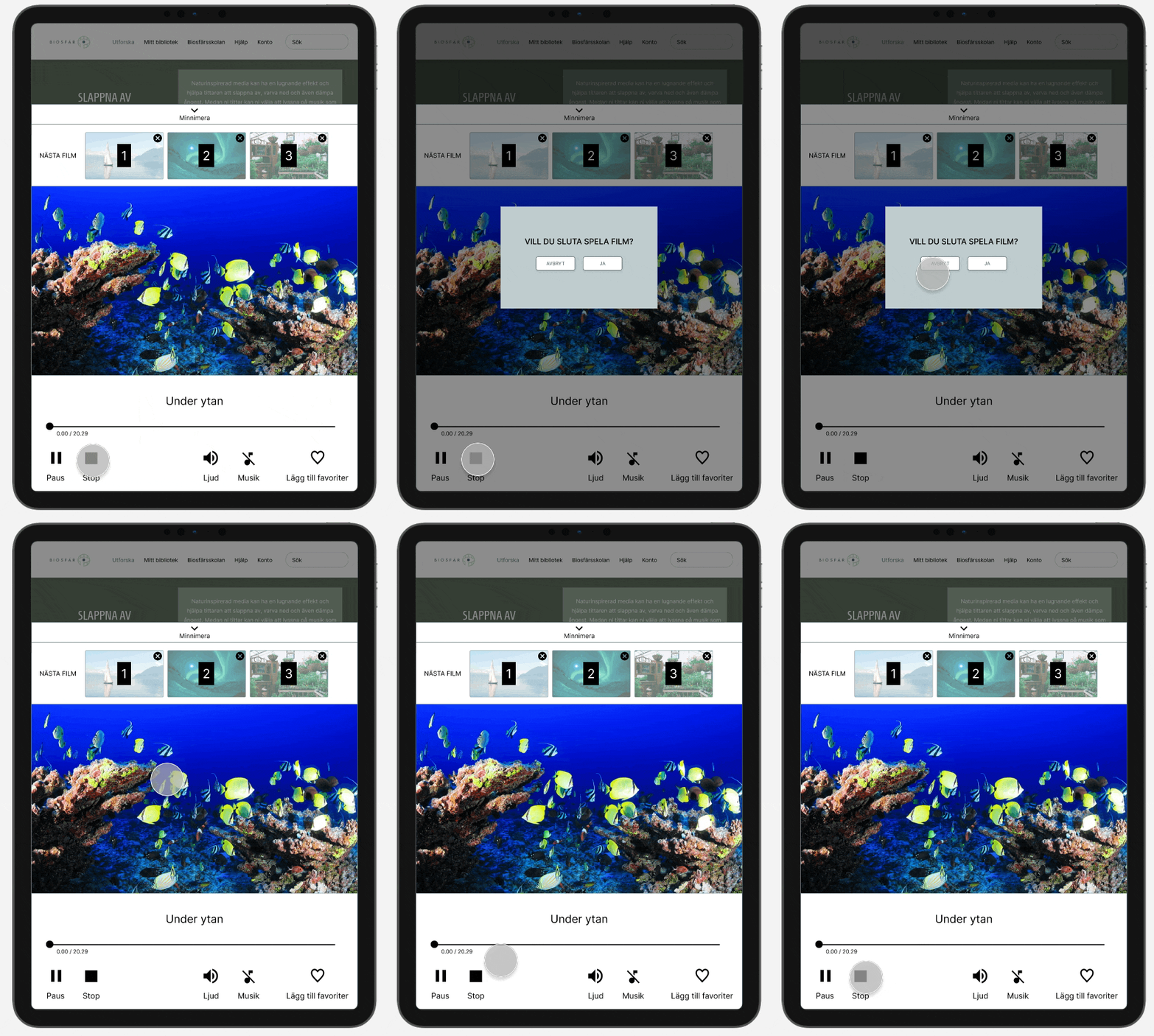
Based on the feedback from the usability tests and Nielsen's heuristics, we made several improvements to the prototype. To make it easier for users to stop broadcasting media, we added a "stop playing" feature using an icon commonly found in media contexts. We also made the media player more noticeable by forcing users to interact with it when they first play a media, and simplified the category names. We also made changes to the buttons on the page for starting media broadcasts, such as changing "playlist" to "collection" and combining "like" and "dislike" buttons into a single "feedback" button. By allowing users to write feedback instead of reacting with buttons, it is now clearer what users think of the media, even when multiple users share the same account.
OUTCOME
User Account
(My main responsibility)
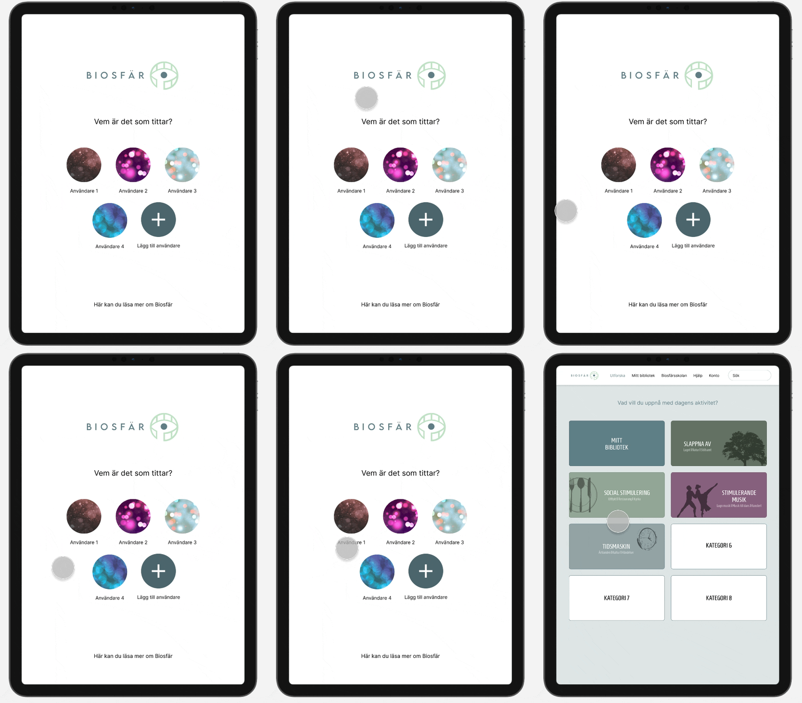
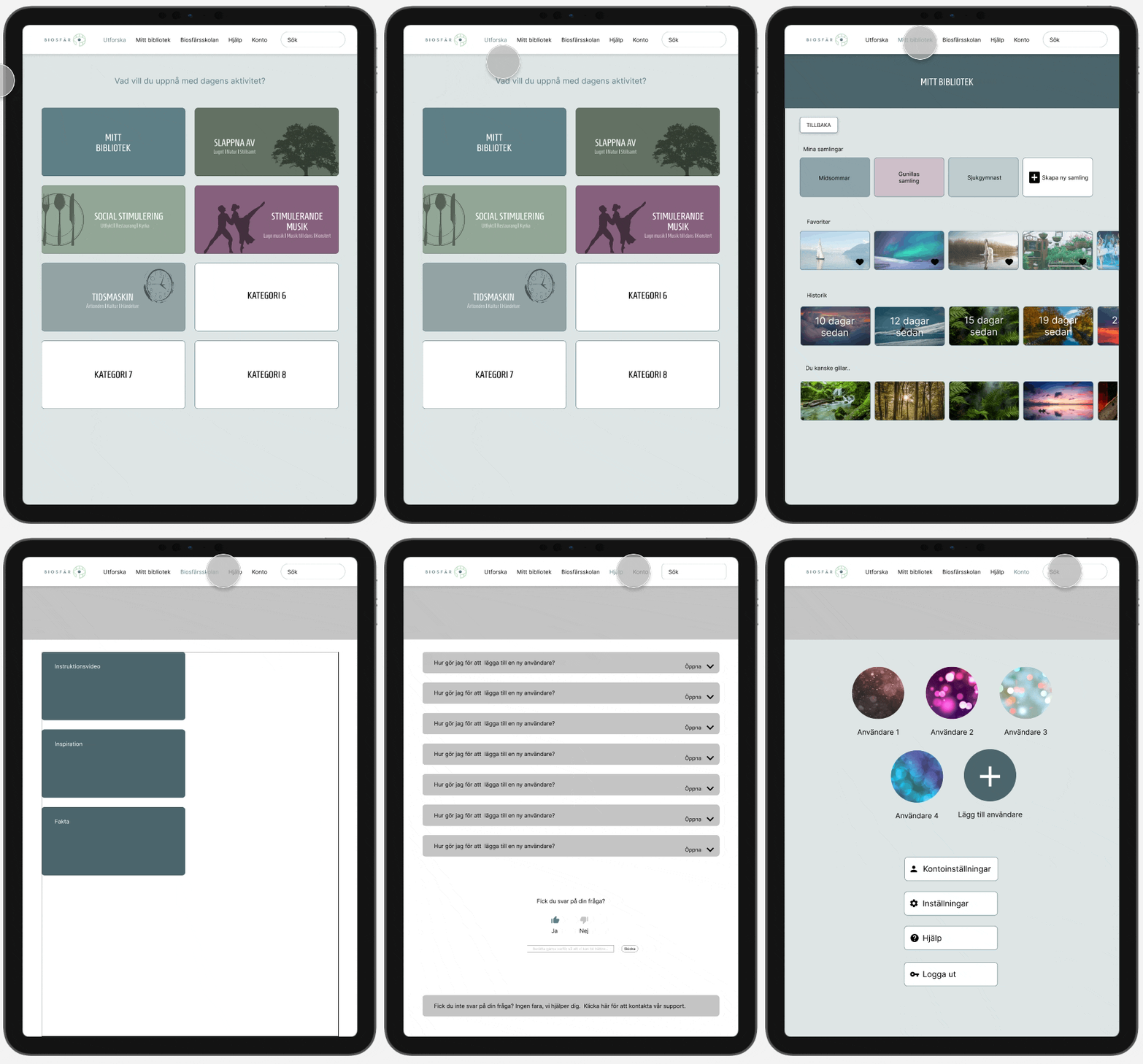
The first step in our interface is to choose a user. The idea is that one account can have multiple users, for example, one account for the nursing home facility with different users for the different departments. In that way, you don’t have to log in every time you want to start the Biosfär, making it more accessible for the users.
The user account has all user account profiles displayed with images and names at the top of the page. By pressing the profile with a plus, the user can add a new profile. At the bottom of the page, four buttons are displayed: account settings, settings, help and log out.
Explore
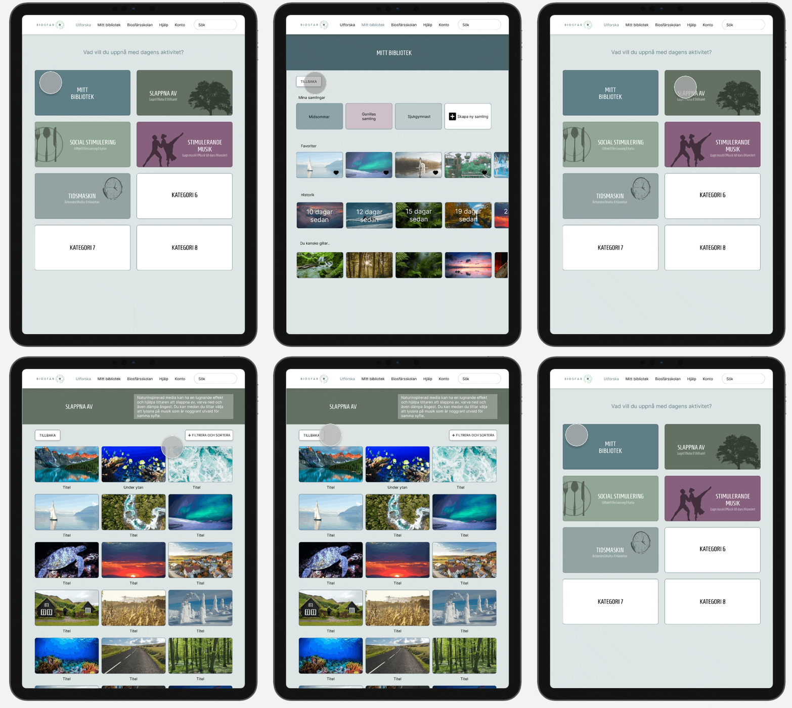
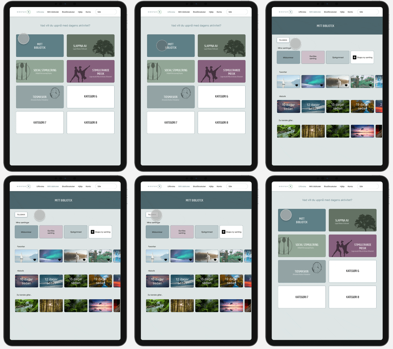
Once a user is chosen, the user gets to the page we call explore. The purpose of this page is to guide the user when navigating amongst media content. From this page, the user can either enter “My library” or use the categories to find new media content based on the purpose of the activity. The categories are named after the purpose of the content, to further help guide the user when finding suitable media for the activity. The category names are also accompanied by words describing the media content to make it even easier to understand.
Inside the Category
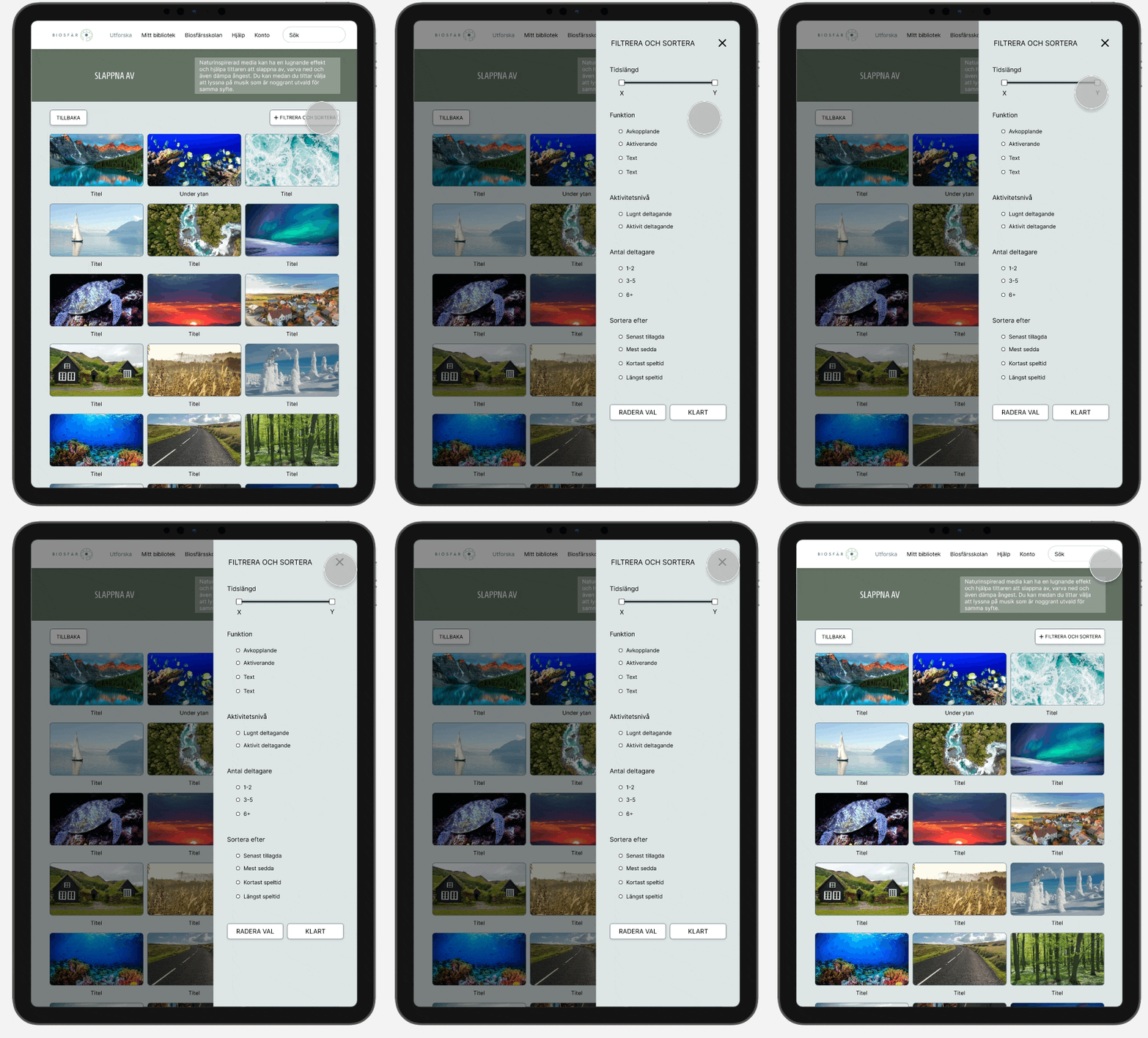
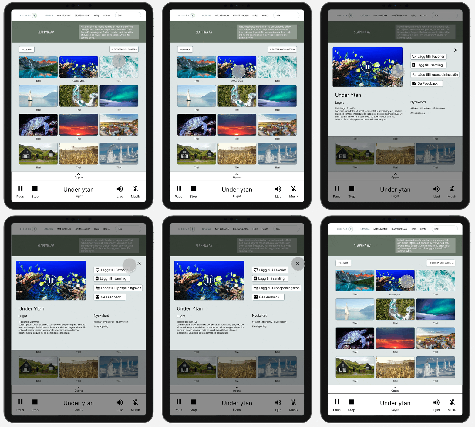
Below is an example of how it looks when entering the category “Slappna av”. The content is presented with pictures and titles. Here the user can choose to filter and sort the media, for example, if the user is looking for something more specific. The function of filtering and sorting opens up as an overlay on the page.
Search Field
The user can also use the search field in the menu to find media. This search field is always available wherever you are in the interface. The content that fits the search is presented similarly as inside a category, with the same possibility of filtering and sorting. The picture below shows how the search field gets highlighted when the user clicks inside it.
Media Player
(My main responsibility)
When pressing the play button on the media description overlay, a media player appears on the screen with the video playing; with the title, related category and video time stamp underneath. At the bottom of the page, five buttons are displayed: play/pause; stop (exit the movie); volume (realistic video related sound); music (for example piano or other classical music); and add to favorites. All videos added to the playing queue are shown in the playing order at the top of the media player. The videos in the queue can be removed by clicking the cross button at the upper right corner of each video. The user has the option to minimise the media player to be able to browse through the application while streaming a video.
When tapping on an image of the media, the media description and other functions open as an overlay. With the help of the buttons on the right side, the user can add the media to their favorites or other collections that they have created, add to the playing queue and give feedback. You can also see the keywords related to the media. On the left side, we have the ability to start the media with a tap on the “play” button. A description of the content, time and in which category it belongs to.
My Library
In “My library” the user can create their own collections of content, for example, to prepare for a certain activity. The user can also enter the categories with favorites, history, and recommendations, through either the title of the category or by scrolling horizontally to the last image in the category of recommendations and enter through that image.
Favorites
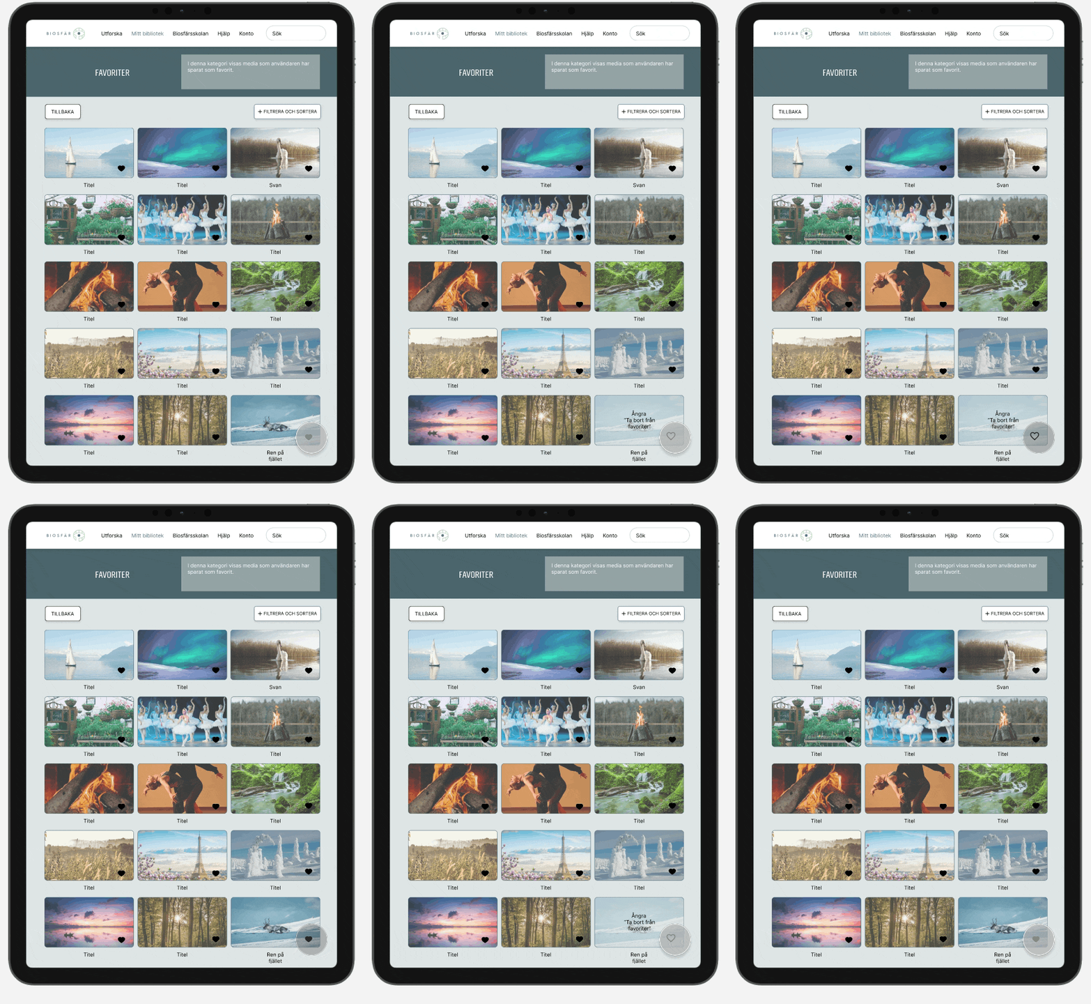
Inside the category of favorites, all the content saved as a favorite is collected. Sometimes it can be a quicker way to save media when you don’t have the time to choose a collection, or when you just want to save it but don’t know where it fits.
By pressing the colored heart, the media gets unmarked as a favorite. While staying inside the category, the user can regret the un-marking until the user leaves the category. This to help prevent unmarking media by mistake.
History
Inside this category, the content that the user has watched recently is collected. This is to enable finding your way back to media content that you liked but don’t remember where you found it or didn’t remember to save it.
Help Page
(My main responsibility)
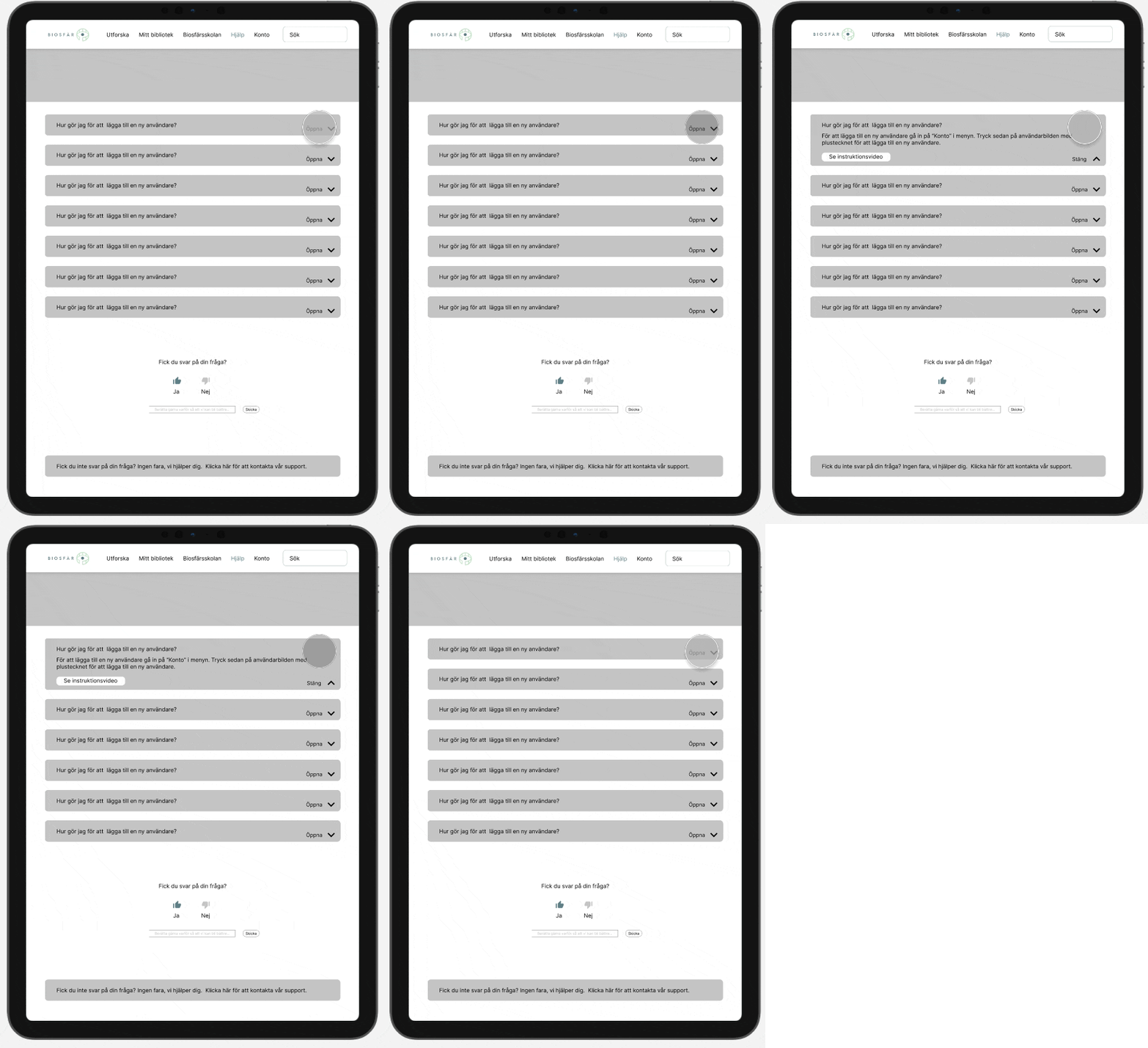
At the help page, the user can find answers to the most common questions asked by other users. The user can then give feedback to Biosfär if the page was helpful or not. Through gathering the feedback, Biosfär can improve their help page in the future. If the user could not find the answer on the help page, they can contact the Biosfär support by pressing the button at the bottom of the page.

Biosfär School
(My main responsibility)
Biosfär school page is a suggested page for the future development of Biosfär. The vision is that the page will offer: instruction videos on how to use Biosfär; inspiration, facts, articles about Biosfär and research behind Biosfär. The page exists today out of three link buttons (from the top, to the bottom): instruction videos, inspiration and facts.

REFLECTION
In summary, the design team encountered two major challenges during the design process of Biosfär. The first challenge was the limited access to the Biosfär due to the pandemic, which made it difficult for the team to observe and gather data from a larger group of end-users. To overcome this challenge, the team used qualitative research methods and worked closely with two expert users at Stureby vårdhem. They also involved their stakeholders in the research process to ensure that their vision for the future of Biosfär was aligned with the design team's work.
The second challenge was that the team initially based their design on the existing prototype of Biosfär, which was not fully developed and required a lot of set-up time for the user. The team realized that they needed to design for the future of Biosfär, which would eliminate the complicated starting process and create a more straightforward user experience. However, this came at the cost of users' freedom to create a specialized experience for a specific group or individuals. The team suggested the creation of "super users" who are specialists in using Biosfär and can create experiences with materials that can be found in the Biosfär. Overall, the team was able to overcome these challenges and create a design that aligned with the stakeholders' vision for the future of Biosfär and provided a straightforward user experience for the end-users.
The main goal was to create an interface that healthcare workers can use easily in a healthcare setting. We focused on usability and the future needs of our stakeholders. Despite the pandemic and limited access to real-life users, we conducted solid user research and testing, which gives us confidence in our final product. The results of our user tests indicate that we have created something of value that is also user-friendly.
My biggest takeaway from this experience is to always keep in mind the end-users and the purpose of what I am designing.