Redesigning the navigation structure of the mobile website Münchenbryggeriet.
As a solo project, my goal for this conceptual UX project was to enhance the user experience by reorganizing and redesigning the content of the mobile site, with a focus on improving the efficiency and speed of information search. The end result aimed to provide users with a more thorough understanding of the website, making it easier for them to find the information they require with greater ease and effectiveness.
ROLE: RESEARCH & UX TIMELINE: 4 WEEKS TOOLS: FIGMA, MIRO
METHODS: OBSERVATION, INTERVIEW, THEMATIC ANALYSIS, EMPATHY MAP, USER JOURNEY MAP,
NN GROUP REVIEW, CARD SORTING, INFORMATION ARCHITECTURE, SKETCHES, WIREFRAME,
HI-FI PROTOTYPE, USABILITY TESTING



PROBLEM DEFINITION
Users of Münchenbryggeriets' mobile website are struggling to get an overview of all the services the company offers and finding the right venue for their events due to a confusing and cluttered interface. This issue makes it difficult and ineffective to find the information you need, which has a negative effect on the user experience and might cause the company to lose revenue.

What is Münchenbryggeriet?
Münchenbryggeriet is a historic building in Stockholm that serves as a gathering place and microbrewery. It offers event spaces for 10-3500 people, with well-maintained and modern facilities, including outdoor spaces with a view of the city. The venue prioritizes sustainability and is recognized as a Nordic Swan Ecolabelled Conference and Restaurant. Its goal is to be recognized as a leading sustainable gathering place in Sweden. Original website: https://munchenbryggeriet.se/
RESEARCH
Interview & Observation
The research involved observing eight individuals aged 23-35, who live and work in Stockholm, as they used the original mobile website.
Additionally, I conducted interviews with them to learn more about their perception of Münchenbryggeriet, the services they thought it provided, their experiences booking a venue, and their expectations for a venue booking mobile website.
Thematic Analysis
Through observations and interviews, a thematic analysis was conducted, identifying the following main themes:
-
Information overload: Users may experience information overload due to the volume of information provided on the website, which makes it difficult for them to distinguish between venues or comprehending their features.
-
Search and organization: Users may have trouble finding the right venue due to an exhausting search process and an unorganized layout.
-
Lack of Engagement: An excessive quantity of text and information, as well as a lack of visually appealing images or layouts, may make users lose interest. Therefore, a user-friendly and contemporary layout is required to draw in visitors and enhance the website's appealing qualities.
"I'M CONFUSED IF I ALREADY READ THIS INFORMATION SOMEWHERE ELSE."
"WOW SO MANY VENUES [...] HOW DO I KNOW WHICH ONE IS THE BEST FOR MY EVENT?"
"I DIDN'T EXPECT THE [MENU] BUTTON TO DROP DOWN. THE OTHER ONE DIDN'T."
Empathy Map
I did an empathy mapping exercise to comprehend the user's viewpoint and pinpoint their pain points. I learned during this process that users were immediately overwhelmed by the website's abundance of textual information. The information didn't seem to be clearly categorized or organized, and it was repetitive. Users also found the layout boring, chaotic, and intimidating.
By rearranging the categories and information layout, an opportunity was uncovered to enhance user excitement, engagement, and the website's overall efficacy as a result of the empathy mapping exercise.

User Journey Map
Drawing on the insights from observation, interviews, and empathy mapping, I developed a user journey map that identified steps in the journey where users were struggling.
It revealed opportunities to improve the discovery and selection steps of the journey by reorganizing the categories and layout to create a more intuitive structure of pages. Additionally, I identified the need to make the information less overwhelming and more engaging, which I later accomplished through the use of images and other visual elements.

NN Group Review
I used the NN Group Review, a checklist based on the 10 general principles for interaction design, to discover and categorize the different areas of issues. I then prioritized these problems based on their level of complexity and time/effort required to address them.
The following issues were prioritized as high.
-
Visibility of System Status: Users can forget which text and pages they've read, perceive repeated information across pages, and lack reassurance that their actions are causing changes on the page.
-
Consistency and Standards: The design of the page has several inconsistencies and usability issues, including inconsistent button naming, inconsistent design for menu options, scattered information across pages, and difficulty differentiating between different types of content due to the use of uniform grey squares.
-
Recognition Rather Than Recall: Users may forget which pages they are on when scrolling away from the menu, and information that belongs to other pages is scattered throughout the website, making it difficult to locate and overwhelming to navigate
-
Flexibility and Efficiency of Use: The app's design overwhelms inexperienced users with too much information and lacks a simplified explanation for booking a venue. Experienced users have to scroll through all the information to make an inquiry, without any shortcut options available. Additionally, the app lacks clear direction signs to show users where they are headed and does not describe on what page the user is currently on.
-
Aesthetic and Minimalist Design: The text on the page competes with each other, creating confusion around which information is essential and what is unnecessary. Additionally, the information is not pedagogically organized, making it difficult to understand and navigate.
Information Architecture
I conducted a card sorting exercise where users were asked to group different functions according to their preferences. The results revealed that users preferred having the inquiry, about, and contact pages as their own category within the menu. Based on these insights, I created an information architecture that reflected these groupings and made it easier for users to navigate the menu.


DESIGN PROCESS
SKETCHES


WIREFRAMES


USABILITY TESTING
Testing
Incorporating user feedback and conducting iterative testing were essential parts of my design process for this portfolio project. By listening to my users and making changes based on their needs and preferences, I was able to create a more user-friendly and efficient mobile website.
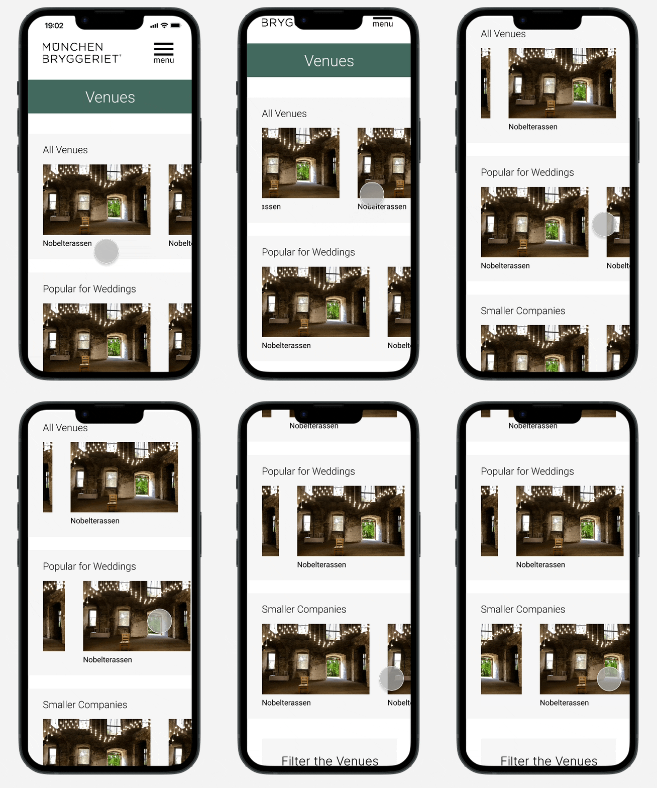
For instance, one user suggested that we add more filters to help them narrow down their venue choices based on specific event needs such as "most popular for wedding-venue." The idea was implemented into the design, which made the process of selecting a venue much easier for users according another round of testing.
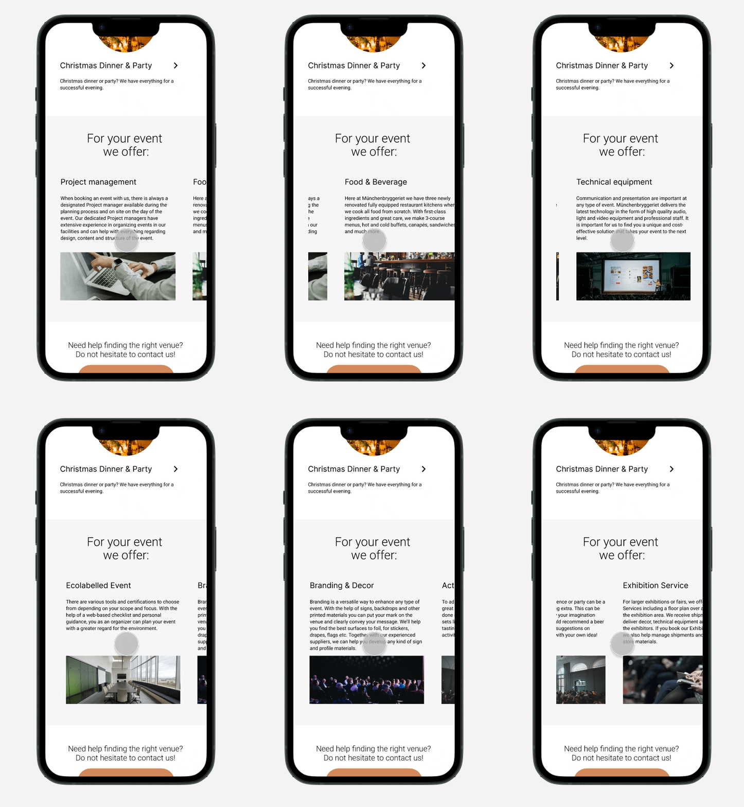
Another user pointed out that the long scrolling on the service page took too much time and made them feel disoriented. To address this issue, I implemented horizontal scrolling for elements such as activities and décor that the user could add to their event. This change helped users to quickly navigate through the page and select the items they wanted.
FINAL OUTCOME
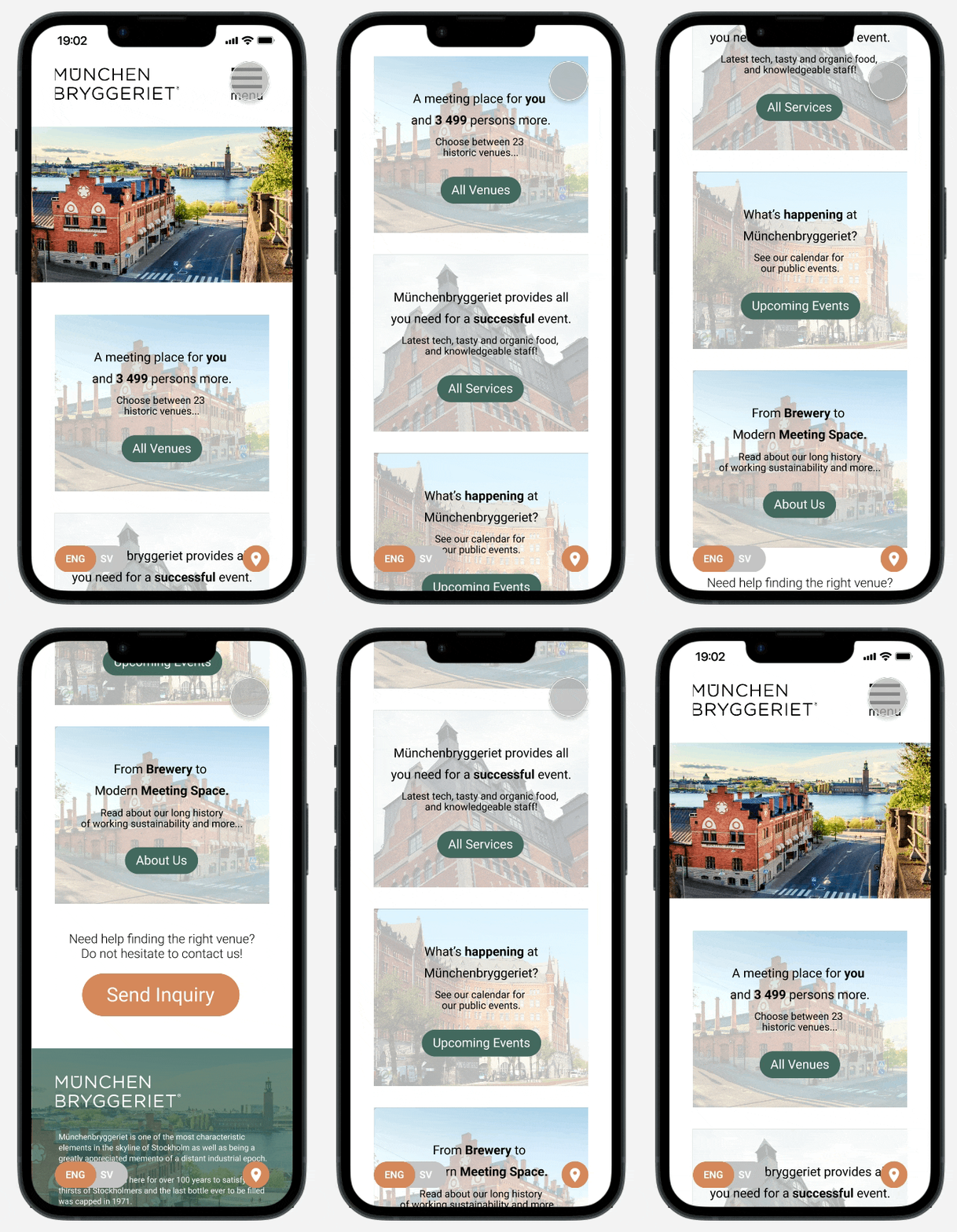
Home Page
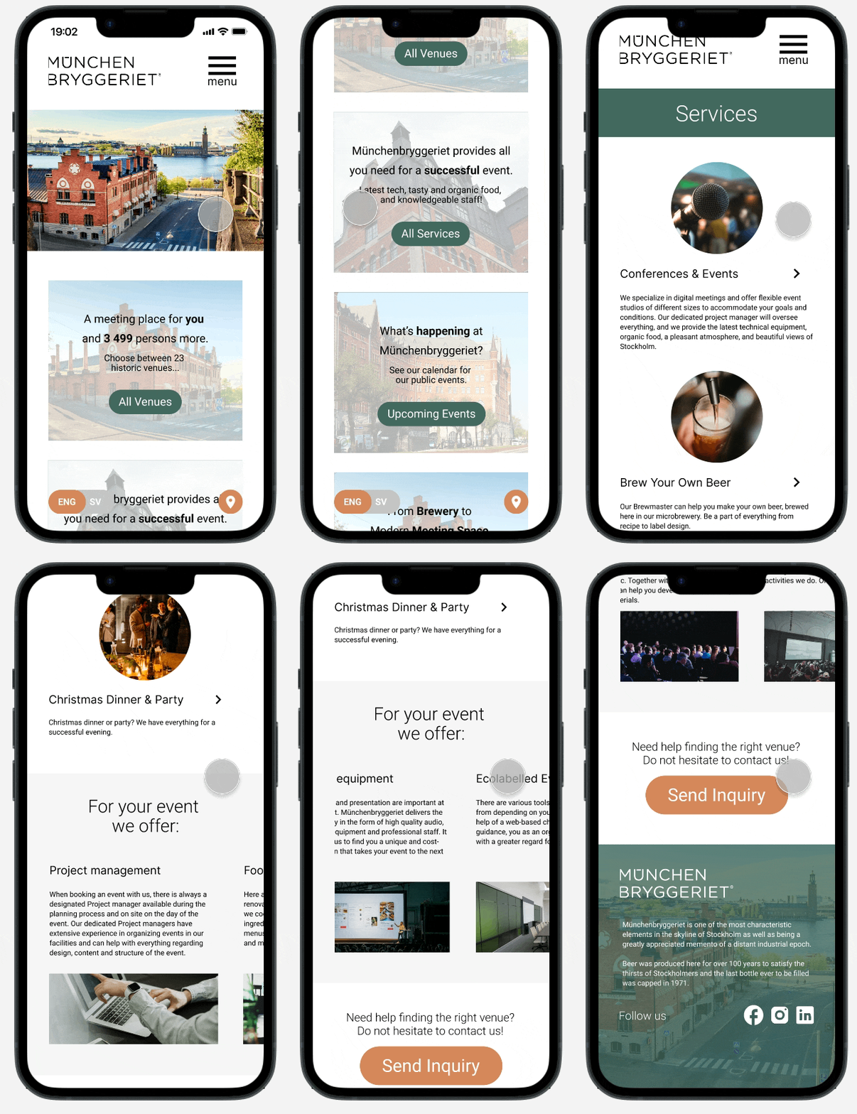
Services Page
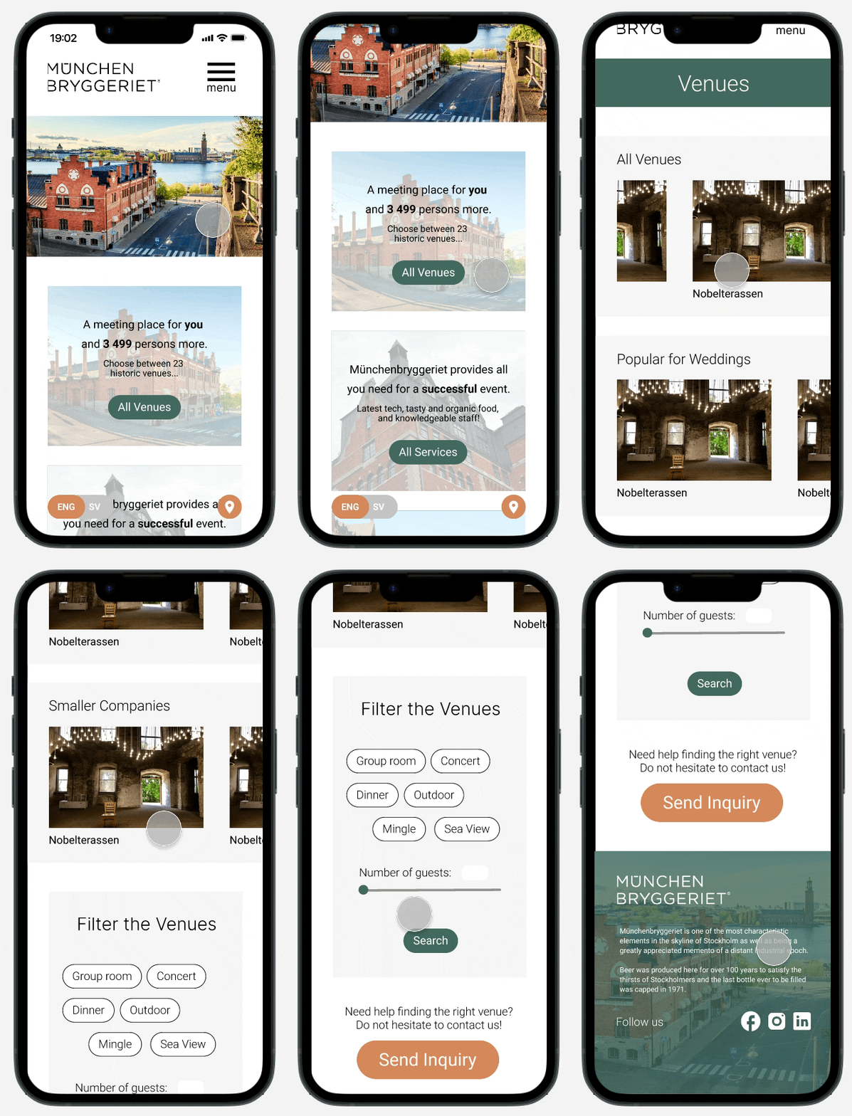
Venues Page
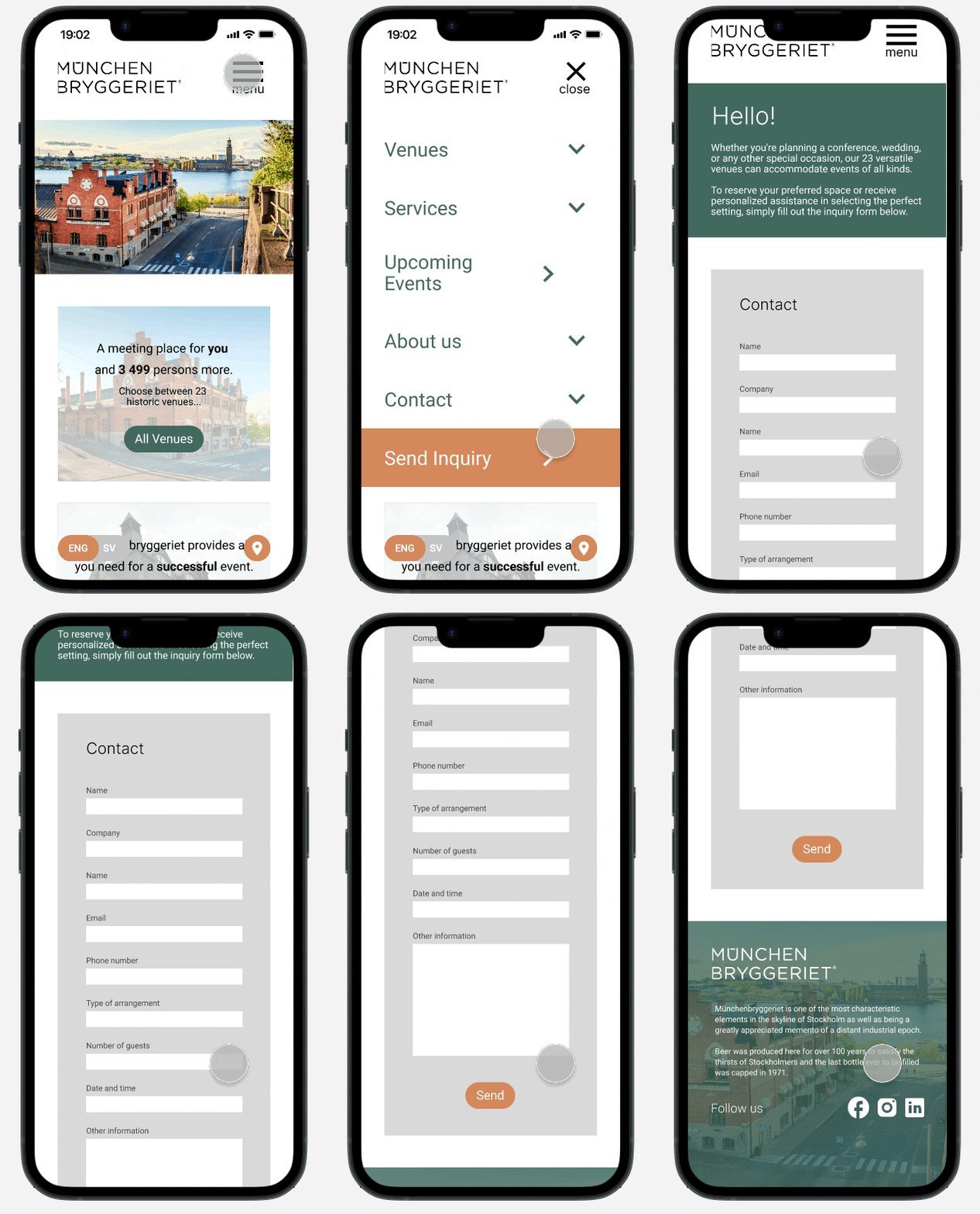
Inquiry Page
Home Page: I shortened the scrolling of the page and reduced the text. The new design provides the user with an effective overview of the company's main deliverables through cool images and an intuitive layout.
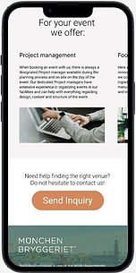
Service Page: I provided the user with a quick overview of the three main service offerings. The user can horizontally scroll to see all options that can be provided for a specific event.
Venues Page: I organized the venues into categories for quick finding. Based on earlier feedback, I added a "search" button to filter venues.
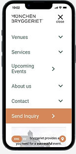
Inquiry Page: I provided immediate information about the inquiry and its purpose. To ensure easy accessibility, I color-themed (orange) the inquiry button and placed it on the drop-down menu and the home page (and at the bottom of the other pages).
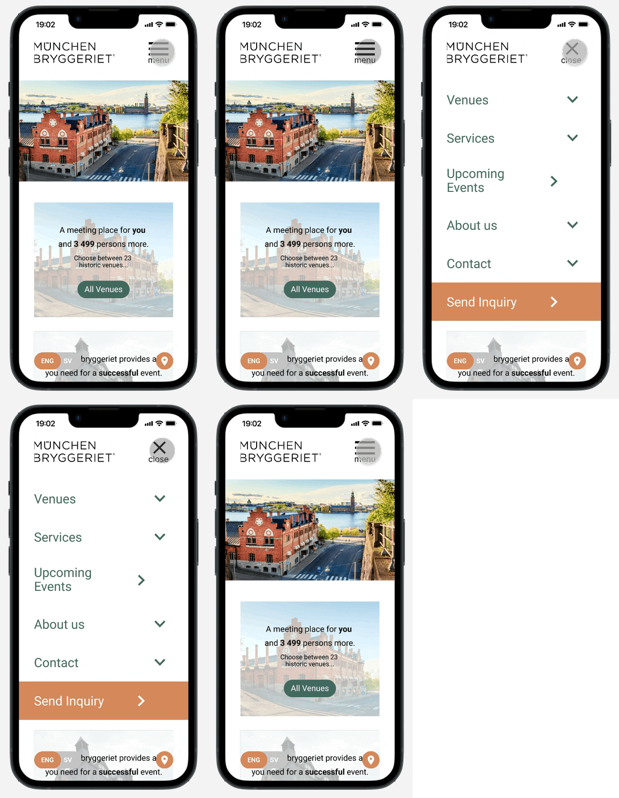
Drop-Down Menu
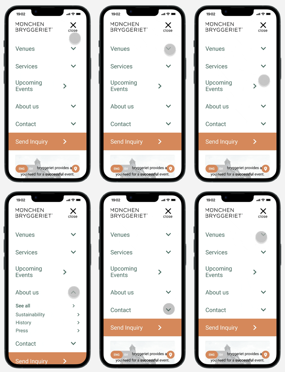
Menu Options
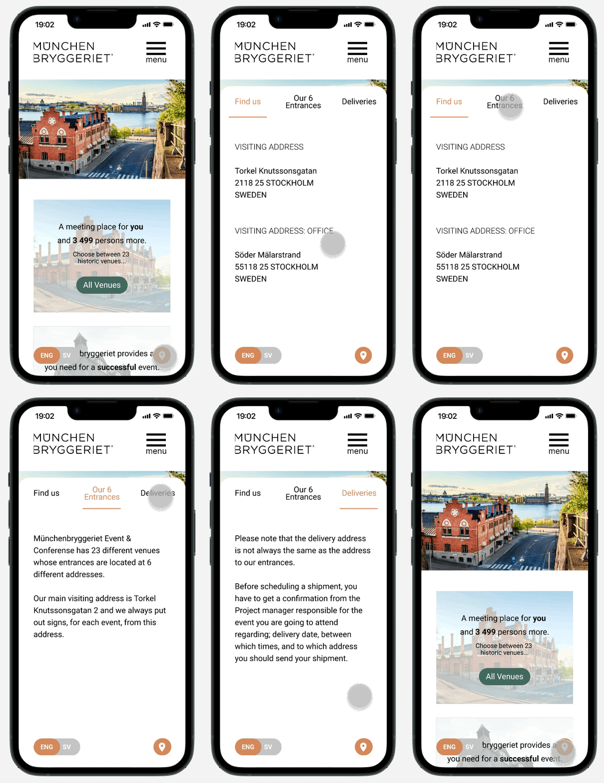
Location
Drop-Down Menu / Menu Options: The order of the pages matches the sequence on the home page. The layout is clean and organized.
Location: I added a sticky button for location which opens up the menu space while keeping the shortcut easily accessible for guests and deliveries.
TRY IT OUT YOURSELF!
"THE CATEGORIES AND THE TITLES MAKE IT EASIER TO UNDERSTAND WHAT MÜNCHENBRYGGERIET OFFERS [...] THE INFORMATION ON EACH PAGE MAKES SENSE. IT LOOKS PROFESSIONAL."
"I LIKE THAT THE MENU IS SO ORGANIZED. IT MAKES IT EASIER TO FIND THE INFORMATION."
"IT'S EXCITING TO SCROLL THROUGH THE PAGE."
REFLECTION
-
Iterative Testing for Early Sketches: Looking back at this project, it's amazing to see how much the end product differed from my original sketches. The iterative process of brainstorming and testing ideas can definitely feel like it takes forever sometimes, at least for me. After a couple of frustrating moments, I made a conscious decision to focus on intensively testing my ideas and sketches with users right from the start. By doing so, I was able to identify and make big corrections early on, before I had even created a digital prototype. This saved me a lot of time and effort, and allowed me to really focus on the smaller details of the design once the big corrections were done.
-
Less Info is More Info: The usability testing revealed that users were able to comprehend the information more effectively when presented with less text. This finding not only reduced the need for excessive scrolling, but also resulted in a more efficient website overview, as confirmed by the latest usability testing observations and interviews. See quotes in the section above. Furthermore, the final observation revealed that the new, structured and organized layout of each page enabled users to scroll and scan content more quickly and effectively compared to the original mobile website design.
-
Summary: Working on an entire UX project independently in under a month provided a valuable learning experience in planning and executing all the necessary steps, from research to final prototype design. Through this process, I improved my ability to prioritize challenges and gained a deeper appreciation of the critical role that frequent user testing plays in informing design decisions. Overall, I thoroughly enjoyed working on this conceptual project and I hope you found this case study interesting. Thank you for reading :)
FUN FACT
The Origin of My Conceptual UX Project
Hi! Want to hear a story about how I got inspired to redesign Münchenbryggeriets mobile website?
Well, it all started when I was hanging out at a cafe with my friend, enjoying the beautiful Stockholm scenery and talking about all the cool places the city has to offer. We mentioned Münchenbryggeriet, which is known for its amazing location near the water and stunning views of the city hall. But we weren't sure if it was actually a brewery or not, so we decided to check out their website on our phones. However, we had a hard time navigating through the pages and understanding the services they offered. That's when I had an idea - what if I redesigned the website to make it more user-friendly and easier to understand!